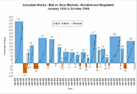
I think the conclusion you can draw from this chart is that the duration of bull markets is longer than the duration of bear markets. Additionally, bull markets nearly always rise higher than the previous bear market fell.
Keep in mind that a 50% fall requires a 100% increase to put you back at the same starting point. Additionally the chart is out of date because as of November 20th, 2008 the TSX had fallen 52% since June 18th, 2008.
When will things turnaround? I don't know, trying to time the market is for fools. Stocks are 'quite cheap' right now so I'm comfortable buying stocks because I have a long time horizon and a high risk tolerance. Perhaps the market will go down further but then stocks won't just be 'quite cheap', they'll be ridiculously cheap.
The advice of investing to your risk tolerance still stands.
That's a great chart! Makes me feel better :)
ReplyDelete